Note: This post contains affiliate links. As a Skillshare Affiliate and Amazon Associate I get commissions for purchases/signups made through links in this post.
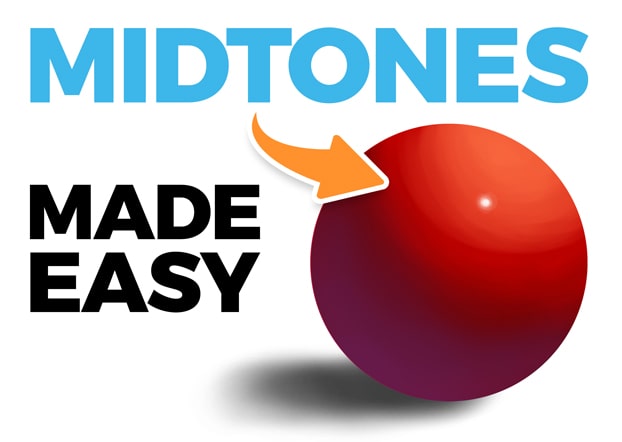
The first step when rendering a drawing is to start by drawing light and shadow.
But then what? How do you make the drawing look more realistic and three-dimensional?
That’s where midtones come in.
In this article you’ll learn:
- what midtones are
- why they are important
- how they work
- how to paint them
Make sure to stay until the end for some cool examples of midtones in real artworks.
Let’s do this!
Table of Contents
1. What Are Midtones In Art?
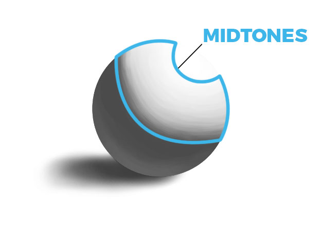
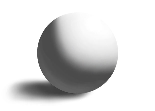
Midtones in art are the tones that lie between the shadow values and the light values. They belong to the light family and therefore are brighter than everything in the shadow family. Essentially, midtones are used to add more details to the areas lit by a direct light and accurately render them.
2. Why Are Midtones Important In A Painting?
Midtones are of essential importance in a painting.
But why?
Can’t you just paint without them and just shade with one light and one shadow value?
Sure, you could do that. And there’s nothing wrong with that. In the end, it’s just a stylistic choice.
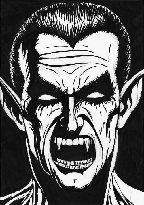
Shading with two values can indeed look great. I do it very often, as you can see above.
But if you do, be aware that your drawings will have a cartoonish look. In real life, shading is much more complex. There are more values to consider.
To make a painting look more realistic, you need to use midtones.
They help you because:
2.1 Midtones Make Forms Look More 3D
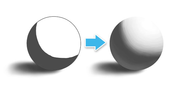
Midtones help you describe the form you are drawing.
If you discard the midtones and only use one light value, kind of the ‘average light’, everything will look flat.
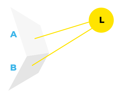
Each plane that’s lit by a light source should have a different brightness – depending on its angle towards the light.
The more a plane is angled towards the light, the brighter it is.
If everything in the light area has the same brightness, it signals to the human eye that there are no changes in the angle towards the light source. Therefore, it’s a flat plane.
Many of the things you will draw, won’t consist of only flat planes, though.
Let’s say you want to draw a human face:
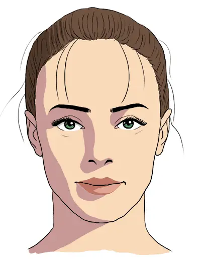
You can go for a cartoon / comic style and draw everything with flat shadows. If you do it right, it will definitely look more realistic, or let’s say believable, than without any shadows.
But to make a drawing look real, you need to use some midtones.
This way you can paint many more little planes, which helps you make everything look more 3D.
2.2 Midtones Display The Local Color Of An Object
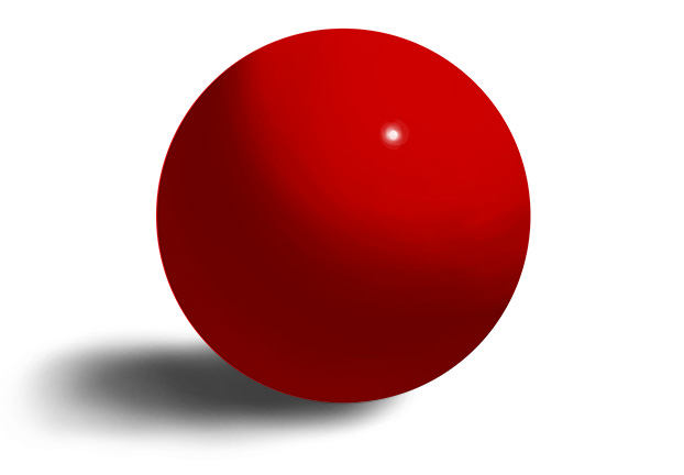
Midtones show the local color of an object.
What is the local color, you ask?
It’s just a fancy way to describe the „actual color“ of an object.
For example, if you’re drawing a red ball, the local color is red.
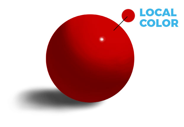
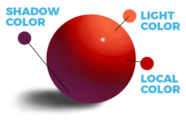
But depending on the light source, the color of the light and shadow tones can vary greatly.
Light tones often have a orange/yellow (warm) tint, while the shadow color often shifts towards blue.
It’s the midtones that display the local color the most:
3. How Do Midtones Work? – The Rules Of Halftones
To paint midtones correctly, you need to know the rules they follow.
There are three rules to adhere to.
You can watch my video breakdown here:
3.2.1 Midtones Are In The Light Family
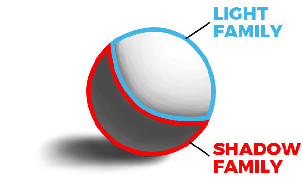
Midtones only appear in areas that are lit by direct light.
That means they belong to the light family.
Accordingly, this leads to the following fact:
Rule #1: Midtones are always brighter than every value in the shadow family.
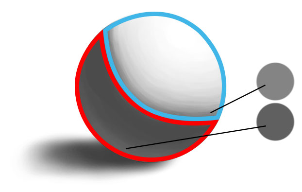
3.2.2 The Brightness Of Midtones
Midtones describe subtle changes of a form.
To do this effectively, you need to determine the correct brightness of the midtones.
The general rule here is this:
Rule #2: The more a plane is angled towards the light, the brighter the midtone.
3.2.3 Lambert’s Emission Law
The final rule to pay attention to is Lambert’s Emission Law.
What first seems to be some unrelated physics mumbo-jumbo is actually a crazy shading hack.
Lambert’s Emission Law says this:
Rule #3: The value change of a form turning away from the light is not linear.
That means that the midtones don’t get darker in equal steps as a form turns away from the light – like:

But instead, the values behave like this:

(Source)
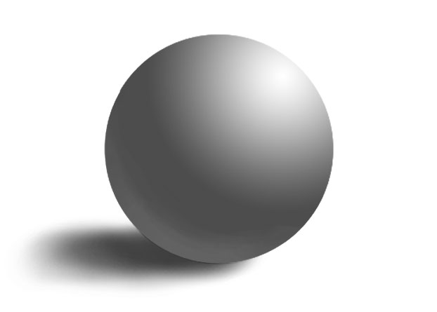
Of course, you don’t have to remember the exact percentages of these value scales.
In the end, it just means this:
- The midtones that are close to the light don’t differ that much in brightness.
- The closer the midtones get to the shadows, the faster they get darker.
Here’s a video that explains it perfectly:
You can also read the great corresponding article here.
Improve Faster With My FREE e-Book!
Learn how to MASTER drawing in 5 easy steps with my FREE PDF guide!
Discover a methodical way to learn drawing effectively!
4. How To Paint Midtones [Step By Step]
4.1 Start With Average Light & Average Shadow
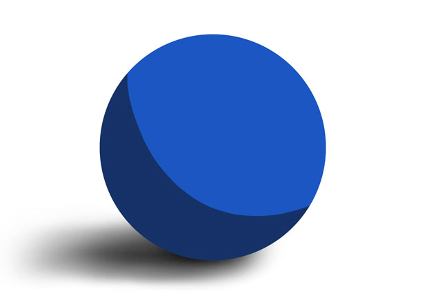
Before you even start painting the midtones, you need to establish a base.
To do that, you need to paint the ‘average light’ and ‘average shadow’ first.
That means to shade everything with just two values – ignoring midtones, reflected light and stuff like that.
In this stage, you pretend that everything is either light or dark and you use just one light tone and one shadow tone.
For the light tone, I used the local color blue.
4.2 Paint The Darkest Midtones By Blending The Shadow Edge
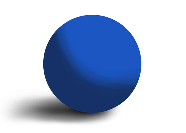
The next step is to paint the darkest midtones.
Remember rule #3:
The value change of a form turning away from the light is not linear. The closer the midtones get to the shadows, the faster they get darker.
This means the midtones close to the shadow are definitely the darkest.
To paint these, I essentially blended the shadow edge.
4.3 Paint The Center Light
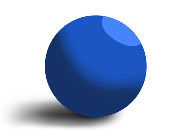
Add the center light to the painting.
This is the area that is brightest because it’s the closest to the light.
4.4 Paint The Lightest Midtones By Blending The Center Light

Blending the center light automatically creates the brightest midtones.
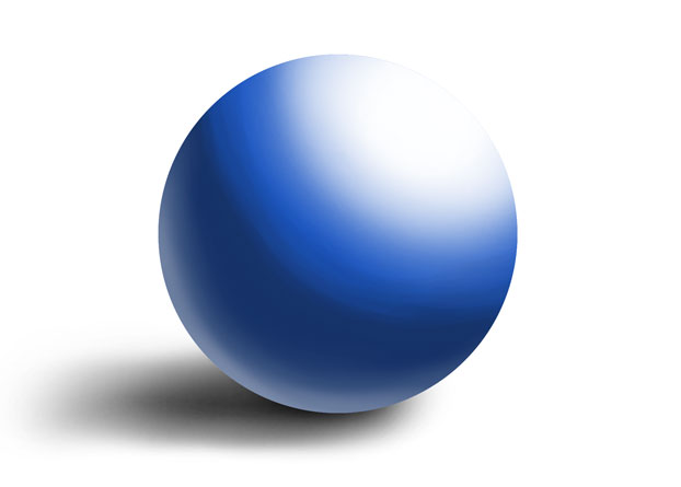
Note: The quality of the lightest values says a lot about the material your object is made of.
The sphere I painted is rather matte. But I can quickly change it to something more reflective, almost metallic looking – just by adding a big white highlight and some reflected light (at the bottom):
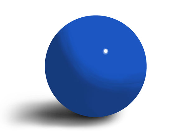
I could also make it look like it’s made of plastic, just by brightening the shadows a bit and adding a small little specular highlight:
But this is a topic that would require another detailed article.
I hope to get to it soon! I’ll link that here, as soon as it’s done!
Definitely check out The Color Survival Guide by Marco Bucci, too. This amazing course will teach you the ins and outs of color in art. It’s pretty much all you need to master color as an artist.
5. Examples Of Midtones In Artworks
Here are some of my finished pieces of art, to illustrate the concept of midtones in real paintings.
To make it easier to understand, I’ve marked the midtones in blue, as good as I could.
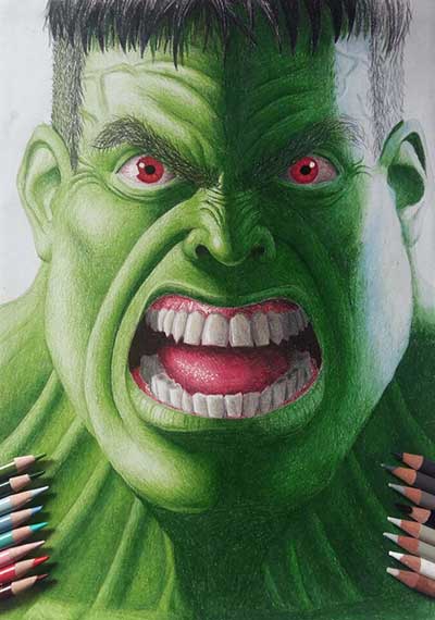
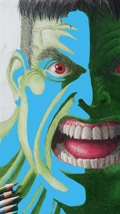
This is a drawing of The Hulk I did a while ago.
If you look closely, you can see how the local color, green, is most intense in the midtone areas.
Here’s a look at the midtones:
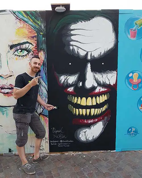
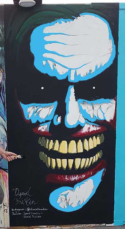
The next one is a big street painting of the Joker that I painted in 2018:
Here, I only painted the darkest midtones, close to the shadows.
It’s a good example of how much 3D information can be conveyed by midtones, even when they are incomplete:
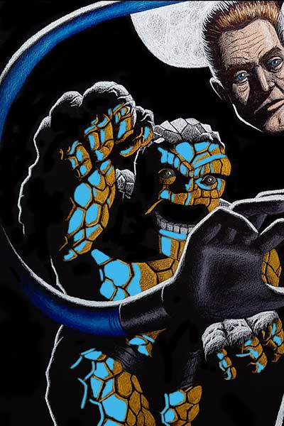
The final example is my drawing of Dr. Doom vs the Fantastic… Two.
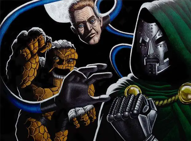
Look at The Thing. Can you see the midtones right next to the black shadows?
Once again, I’ve marked them for you:
CHECK OUT: Must-have Art Equipment I Recommend
Conclusion
The correct use of midtones is no easy feat. It’s something I still struggle with myself.
Finding the average light and average shadow is kind of the easy part – at least in my opinion. That’s probably why I enjoy black and white drawing so much:
Unless you use crosshatching to simulate grey values, you don’t have to think about midtones at all.
But I realized the importance of midtones for great paintings, so I guess this article was some kind of art therapy for me…
I definitely learned a lot – and I hope you did, too!
READ NEXT:
Where Are The Shadows On A Face? [And How To Draw Them]

YOU ARE A TERRIFIC, WELL ORGANIZED, CLEAR EXPLAINER…THE TUTORIAL, THE GRAPHICS, THE VIDEO WERE SUPERB. THANK YOU!
Wow, thanks a lot, Selina! 🙂 Glad you like it!