Note: This post contains affiliate links. As a Skillshare Affiliate and Amazon Associate I get commissions for purchases/signups made through links in this post.
Does your digital art look bad?
Is it pixelated, muddy or soft?
Can’t you figure out how to make it look better?
In this post, I’ll guide you through nine common digital art mistakes, explain why your digital art doesn’t look appealing and offer tips for how to improve.
Common reasons why your digital art looks bad are using too much or too little contrast, overuse of the dodge & burn tools, only painting with soft brushes, using too much saturation, and overusing custom brushes and textures.
Let’s get into the details!
Table of Contents
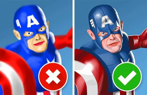
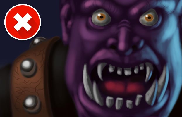
1. Too Much Contrast / Overuse Of Dodge & Burn Tools
No matter what you are painting or what medium you use – contrast is important.
It’s a fundamental principle of art. It’s appealing to the eye and can really make a painting seem to jump off the page.
However, you can also use too much contrast.
It can overtax the eyes of the viewer and make the painting seem unaesthetic.
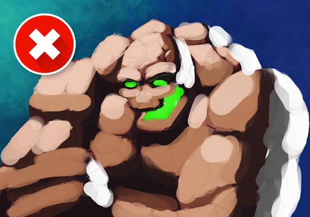
Too much contrast is often the result of overuse of the dodge & burn tools.
Especially to a digital art beginner, these tools seem useful. They brighten (dodge) or darken (burn) colors and seem like the ideal tool for lighting and shading.
The problem is this:
The more you go over an area, the brighter/darker it gets – which leads to too much contrast quickly.
Moreover, the dodge & burn tools only add white or black to a given color.
In the real world, areas of light and shadow aren’t just a brighter or darker tone of the base color.
They actually have a slightly different saturation/hue most of the time.
Another problem with the dodge & burn tools is that they add random yellow/orange tones at the edges of your brush strokes.
CHECK OUT: Tablet With Integrated Screen – XP-Pen Artist Pro 16TP (review)
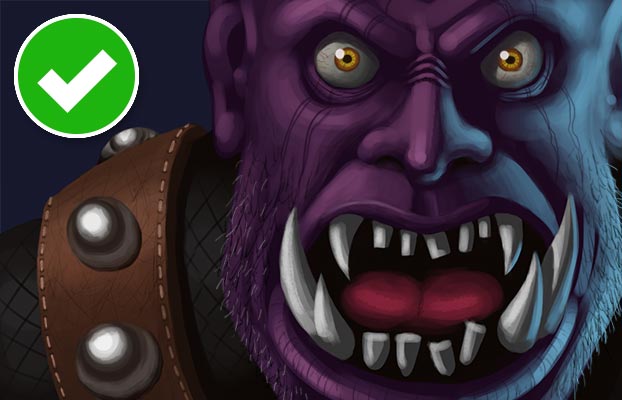
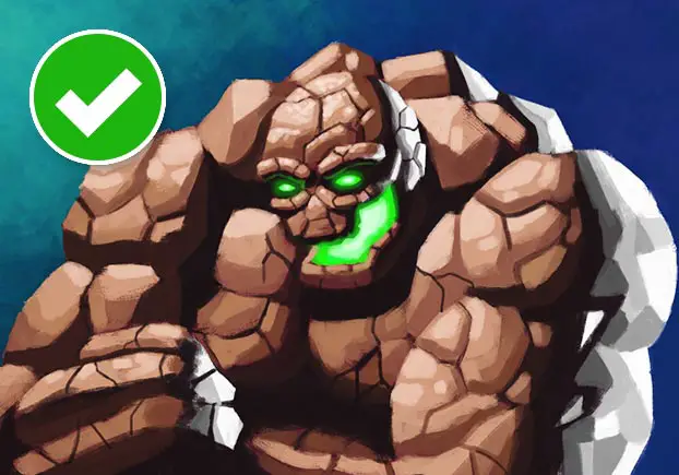
The Solution: Use Targeted Contrast And Avoid Dodge & Burn
The solution is to use contrast wisely and avoid the dodge & burn tools altogether.
Pick your light and shadow colors by hand instead of relying on the dodge & burn tools.
And then use a targeted approach to contrast:
Don’t use high contrast everywhere. Only push it in the areas you want the viewer’s eyes to focus on.
Note:
If you want to take a more stylized/graphic approach to art, using (very) high contrast can of course work well. Painting using just black and white is an example. Besides, there are some lighting situations that lead to extreme contrast – extreme spotlights or a studio lighting setup, for example. But I consider these more like exceptions to the rule.
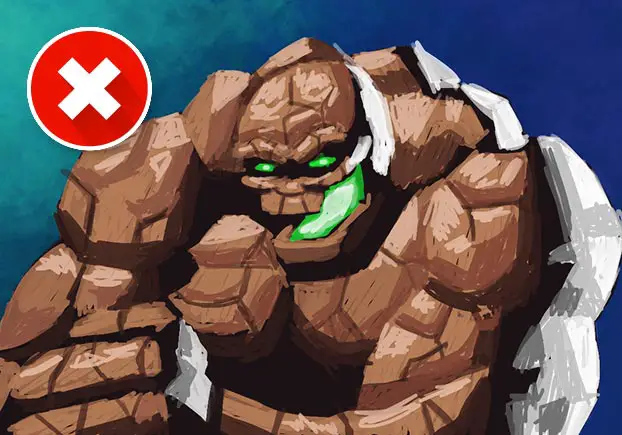
2. Not Enough Contrast
While many people apply too much contrast to their paintings, other ones use too little contrast.
Concentrating contrast on specific areas of a drawing (see #1) is generally a good idea.
But not using enough contrast overall is a problem in and of itself.
It makes a painting look muddy and grey(ish).
Of course, there might be situations where that’s exactly what you want.
For example, you might want to draw or paint a nebulous swamp scene that conveys a sense of dismalness. Here it’s probably advisable to use very little contrast.
But for everything else, it’s probably wise to use a certain amount of variety in brightness values.
The Solution: Use An Appropriate Amount Of Contrast
If you have this problem, compare your art to that of professional artists that you like – side by side.
Does yours look muddy? Then it’s probably a good idea to use a little bit more variety in your values.
Make your bright tones a bit brighter and your dark tones a bit darker.
Be careful though or you will end up with problem #1 (too much contrast).
Learning to use the right amount of contrast can take some time, but with enough practice you will get good at it.
CHECK OUT: Why You Can’t Draw Anymore
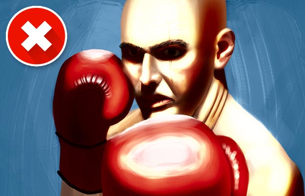
3. Too Much Smudging / Using Only Soft Brushes
Another reason your digital art looks bad is the overuse of the smudge tool and soft brushes.
Just like the dodge & burn tools, these ones seem like a shortcut for quick and easy shading.
You just draw a lit area and a shadowed area and smudge away to easily create a smooth transition between them.
Or you just use a soft brush from the get-go and create your gradients that way.
The problem is that it makes everything look soft and too perfect.
Just using soft brushes for everything leads to a lack of edges.
Everything becomes blurred and the whole painting lacks focus.
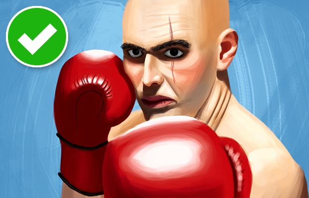
The Solution: Avoid The Smudge Tool And Use A Combination Of Hard And Soft Brushes
The solution to this is twofold:
First, you should avoid the smudge tool.
What’s a better way to create gradients between dark and bright areas?
Try this technique, for example:
The video explains how to blend colors with a hard brush.
If you don’t push it too far, this method will make your picture look more painterly compared to using the smudge tool or soft brushes.
The second solution is to use both hard and soft brushes.
This way you get the best of both worlds: Soft transitions, but enough clearly defined hard edges.
The following two videos explain it well:
4. Using The Wrong Brush Size
Many people are unsure which brush size to use. This can lead to a whole host of problems.
CHECK OUT: Must-have Art Equipment I Recommend
4.1 Just Using Small Brushes
If you just use small brushes, everything will look sketchy.
There will be too many little dots and lines everywhere – small details that aren’t really helpful, but just overtax the eye.
In addition, everything will take a lot longer to paint. It just takes more time to finish a painting with a small brush.
Hence, the general advice is often to use bigger brushes.
4.2 Just Using Big Brushes
But if you just use big brushes, everything will look blocky and undefined.
It’s good for color blocking, but at some point you need to refine everything to get your painting out of the early stages.
The Solution: Use Big AND Small Brushes In The Right Situations
The best practice is to use big and small brushes when each is most appropriate.
- Big brushes are very useful in the early stage of a painting. They can be used to create little preliminary thumbnails and they help you lay down paint quickly until you get the general colors and values right.
- Small brushes are needed as soon as your painting leaves the blocking phase. You need them for small refinements and for the addition of details – otherwise, your painting will never look finished.
Rule of thumb:
Resize the brush according to the size of the detail you are painting. The smaller the detail, the smaller your brush should be. In other words:
Make your brush as big as possible, but as small as needed.
Here’s a page with a lot of digital art process pictures.
In a lot of these you can see how the art starts with big brushes and gradually uses smaller and smaller brushes for more details.
» Digital Art for Beginners – Unleash Your Creativity
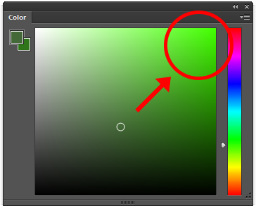
5. Too Much Saturation
Digital art beginners often tend to oversaturate colors.
They just think of the base color of objects and the natural tendency is to pick a bright and very saturated one.
For lighting and shading they just add white or black (see #1).
Unfortunately, there’s much more to color than that.
Light and shadow areas have different color nuances and aren’t just brighter or darker variants of the base color most of the time.
Furthermore, every color is affected by the colors surrounding it:
If you paint everything super saturated, your digital artwork will look bad and unpleasant for the eye.
The painting will also have no focal point because everything in it screams “Look at me!“.
The Solution: Use Saturated Colors In Moderation
Don’t make every color very intense or you will have too many competing elements.
Instead, use saturation where it’s appropriate.
The most saturated colors should be used in the areas of your painting that you want to stand out.
Final tip:
Avoid the very bright and saturated colors.
Improve Faster With My FREE e-Book!
Learn how to MASTER drawing in 5 easy steps with my FREE PDF guide!
Discover a methodical way to learn drawing effectively!
6. Colorizing Grayscale
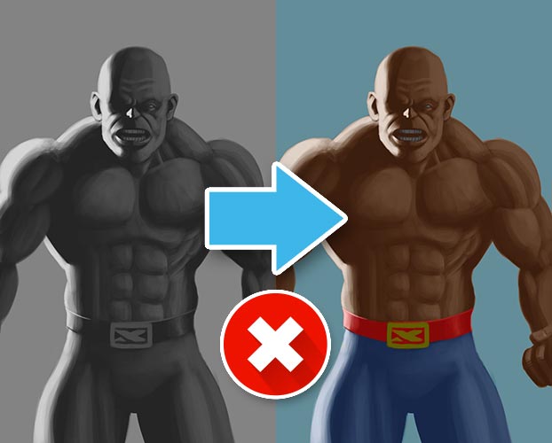
Colorizing grayscale is not as easy as it sounds.
It’s a common approach of beginners and the idea is simple:
You try to separate the lighting and shading process from the base colors of the painting.
If you follow this route, you first paint a grayscale version of your artwork and then “just add the colors“.
But it’s not as simple as it seems to be:
Often the brightness values don’t match.
If you paint a grayscale image in a way that looks good in grayscale, you will have to use a good amount of contrast.
But then the bright areas will often be too bright and the dark areas too dark for colorizing because the base colors have an inherent difference in brightness.
Yellow is always brighter than purple, for example.
Just look at what happens with a color wheel, if you convert it to grayscale:
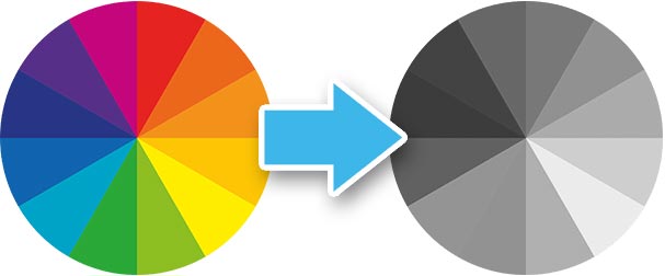
Can you see it?
The colors all have a different brightness.
That’s why the colors in a colorized grayscale variant often look “wrong“: The brightness is too high or too low for the intended outcome.
Let’s use yellow as an example again:
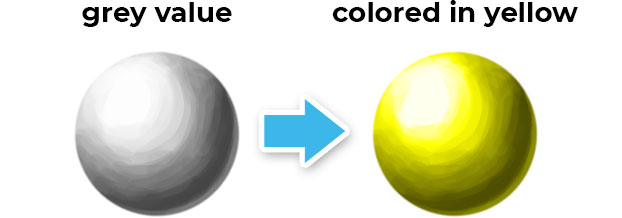
In this case, you would have to paint the whole ball in a more even grey tone, to make it work. The lights and shadows would need to be closer in value to the mid-tones.
This wouldn’t look good in grayscale though – defeating the whole purpose of the method.
Another problem is choosing the right blending mode.
Every blending mode delivers a different result.
Let’s take a look at my painting from above with two other blending modes:

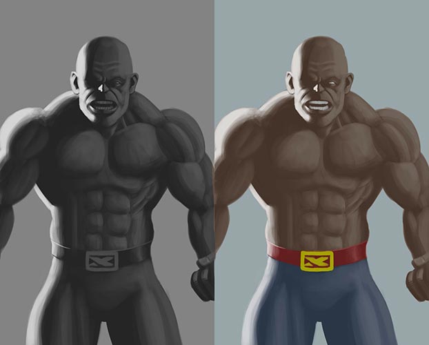
Beyond that, not only picking another blending mode changes the outcome. Choosing a different color for painting on the color layer does so, too.
In this case, I would need to use more saturated colors. The ones I chose didn’t work with the “color” blending mode, and they don’t work with the “overlay” and “soft light” ones either.
Here’s a quick guide on some blending modes and how they work.
In the end, it’s pretty much impossible to choose the perfect colors right from the start – without the need to do profound color corrections later on.
CHECK OUT: 6 Characteristics Of Good Art
The Solution: Don’t Colorize Grayscale Images
Just don’t do it.
If you want to paint a grayscale painting, paint a grayscale painting.
But if you want to create a colorful artwork, use colors right from the start. This way you will improve faster at using colors, too.
If you want to dive deeper into the topic, check out these two helpful videos:
Note:
Yes, I’m aware that colorizing grayscale paintings can work. Even some professional artists do it. But I don’t think it’s great for beginners because the technique itself requires a lot of knowledge and a lot of trial and error.
7. Overuse Of Textures / Custom Brushes
Simply put, too much texture can quickly make your digital paintings look ugly.
I get it:
Especially to a new digital artist, it’s promising and exciting to be able to add texture to a painting immediately and easily.
Applied in moderation it can be effective and look good, but most of the time you will probably end up with something that looks photoshopped and fake.
There will be too many details that distract the eye.
Custom brushes are like gimmicks. While they are nice in theory, they can quickly detract attention from the basics.
Let’s say you want to paint a wood plank.
You could go ahead and just add a wood texture to a basic painting:
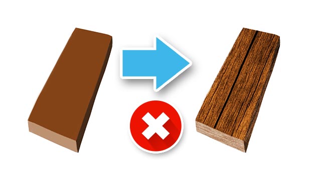
But that’s not painting. That’s basically digital compositing.
Then, you could choose a texture brush with a random texture that somewhat resembles wood and lay down a few strokes:
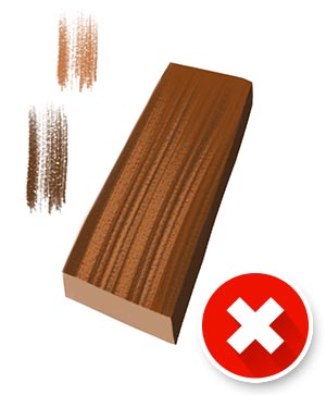
That looks alright at best.
Both methods are like the easy way out and won’t really improve your painting skills in the long run.
» Digital Painting: From Sketch to Finished Product
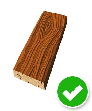
The Solution: Use Textures Sparingly Or Draw Them By Hand
Beginners should focus on the basics like composition, lighting and shading, color, etc.
Draw textures by hand. That way you can’t overdo it as fast.
If you want to use custom brushes with textures, use them sparingly!
Here’s an example of the wood plank from above, just painted by hand:
8. Overuse Of Layers
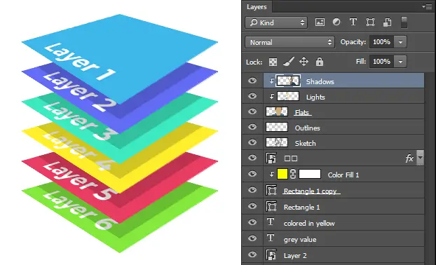
Can you actually “overuse“ layers?
Yes, by simply using too many of them.
By now you probably noticed that many of the reasons for bad digital art I mentioned are caused by “shiny object syndrome“.
Often, beginners love layers.
And it’s okay, they can be a useful tool, but they can also hamper the painting process.
You add one layer. Then another. Then another. And another…
Sooner or later it looks like this:
The result is that every object or character in your scene has too perfect edges.
The elements often don’t integrate into the scene organically anymore.
The Solution: Try Painting Everything On One Layer
Just one layer?
Yes. After all, that’s basically what traditional painters do on canvas the whole time.
Sure, there are people who use stencils (and that’s where layers in digital painting programs probably originated from).
But that technique is way more time-consuming and hence not as prevalent as layers.
How do you know if you have too many layers?
Simple:
- If you have to think about which layer you are on before every stroke, you have too many layers.
- If you feel like your painting is ruined because you’ve accidentally painted on the wrong layer for some time, you have too many layers.
I actually find painting everything on one layer quite liberating.
You can just paint – instead of thinking about the technical things all the time. And if something goes wrong, you just paint over it.
CHECK OUT: How To Improve Your Art Quickly
9. Canvas Too Small
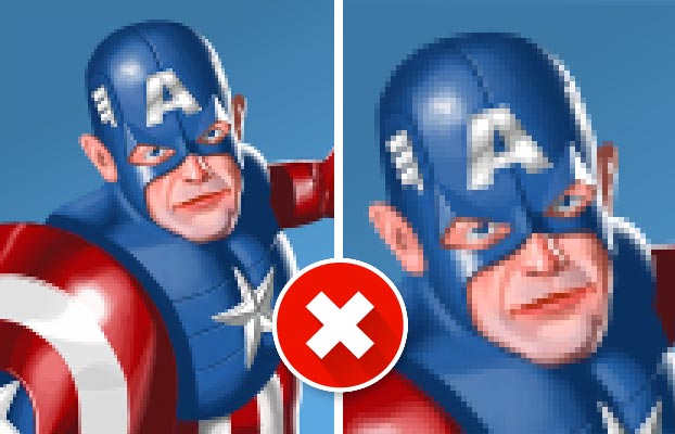
The last reason your digital art might look bad is a simple technical one:
Your canvas may be too small.
If you zoom in one or two steps and everything looks pixelated, your canvas should be larger.
What’s the best canvas size / resolution for digital painting?
It all depends on what you want to do with the finished painting.
- For digital output:
Full HD (1920 x 1080 px) is a good start. If you want to draw more details, everything needs to be crisp, even if you zoom in. In that case, you can even double it to 4K (3840 x 2160 px). - For printing:
Choose the size you want to print at in inches or cm and set the resolution to 300 dpi (dots per inch).
That’s A Wrap!
Write in the comments below which tips you found the most helpful.
Please let me know if you know any other reasons for nasty-looking digital art!
P.S.: I’m on YouTube, Instagram and Facebook, too. I’d appreciate it if you check it out!
READ NEXT:
Rendering In Digital Art – The Ultimate Beginner Guide
I am so glad you shared this information. It is very helpful for me.
No problem. I’m glad I could help!