Note: This post contains affiliate links. As a Skillshare Affiliate and Amazon Associate I get commissions for purchases/signups made through links in this post.
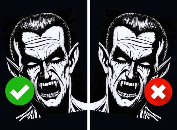
Have you ever wondered why your drawings suck when looked at in the mirror?
Have you ever finished a piece of art that you thought was amazing and symbolized the apex of your current skills – so good that you were eagerly awaiting your invitation to artists’ Valhalla – just to turn it around and think that you can’t draw at all?
It happens to all of us, even advanced artists with lots of experience.
And it’s actually not a bad thing – it’s amazing! It’s like magic!
Read further to learn why this is a good thing and why many artists intentionally flip their canvas.
Table of Contents
1. What Flipping Your Art Does
Flipping your drawings confronts you with the reality that you maybe can’t draw as well as you thought yet. Therefore, it’s probably something you fear and avoid doing.
It shouldn’t be!
But first, let’s examine what mirroring your canvas does:
To illustrate this, I’ll use a few of my own drawings.
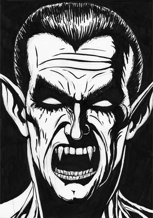
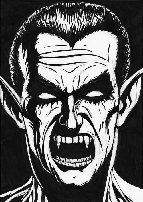
You see, it also happens to me regularly. Some months ago I finished this little Dracula drawing. It started as a sketch and was actually meant to be a test for my new Sakura Pigma Brush pens.
(Check out all my art tools here.)
I liked it though and put two or three hours into the rendering.
This is what it looks like:
Back then I kinda liked it. But I didn’t feel so good about it anymore once I flipped it.
So let’s take a look at what happens when you mirror it:
Yep, that kinda sucks.
I wasn’t even particularly trying to see my own mistakes.
I had hung the drawing in my living room and as it happens, I have a large mirror in my doorway.
One day I saw my drawing in the mirror and was drastically confronted with my own mistakes and how off my picture somehow looked to me.
Let’s take a look at another example:
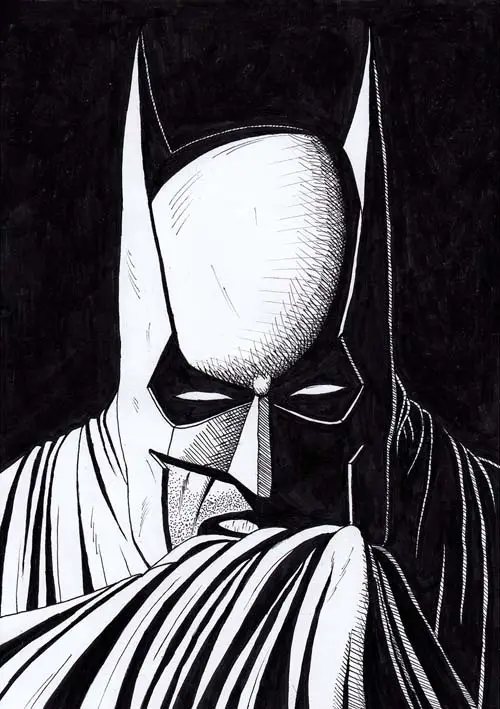
A Batman drawing I did at the beginning of 2019:
Let’s mirror this one too, to make its mistakes apparent:
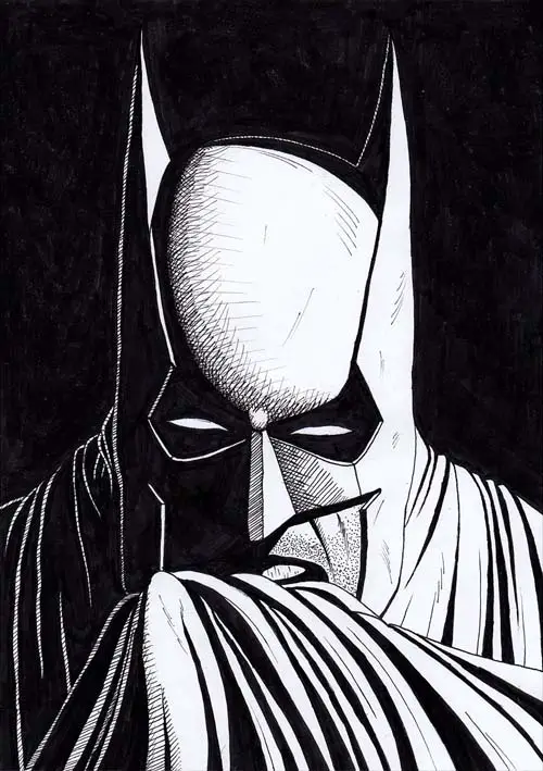
Can you see it? It just looks off in some way…
But why is that? Why is it that your drawings look worse in a mirror?
RELATED: 6 Things That Make For Amazing Artworks
2. Why Your Drawings Are Skewed Or Slanted
Your Drawings are skewed or slanted because of a scientific phenomenon called the mere-exposure effect. While drawing, the longer you see your drawing, the better it will seem to you. This prevents you from recognizing your own mistakes and you won’t notice when your drawing is slanted.
So, it has to do with how your eyes and your brain get used to things.
The same thing holds true if you look at yourself in a mirror:
Every day you see your own reflection when you get ready for the day. It’s what YOU look like to yourself.
When most people look at a photograph of themselves they feel that it looks bad.
The thing is that they probably look perfectly fine to everyone else because everyone else knows them exactly the way they look like in the photograph.
Actually, it’s the image in the mirror that you are used to that doesn’t look like reality.
It’s the same thing when listening to a recording of your own voice:
Most people think their voice sucks and sounds just weird while it’s actually totally okay for everyone else because they know the voice just that way.
When you listen to your own voice while talking though, it’s totally skewed by the acoustics of your skull.
Your brain gets used to the way your mirror image looks and the way your voice sounds to yourself. It’s what’s normal for you.
Improve Faster With My FREE e-Book!
Learn how to MASTER drawing in 5 easy steps with my FREE PDF guide!
Discover a methodical way to learn drawing effectively!
In the same vein your brain gets used to two more things related to drawing:
First, it gets used to the drawing itself.
Depending on the complexity of the artwork you might spend hours and hours on it. Your brain gets used to it and also to its mistakes, thinking that it looks alright, even though it might be skewed.
You basically become blind to your own mistakes. Flipping the artwork can help put things into another perspective.
Secondly, your brain gets used to the drawing mistakes you make on a more global level.
You might tend to draw something particularly asymmetrical all the time and your brain thinks it looks fine.
Flipping your pieces circumvents this adjustment effect of the brain.
To summarize:
Your drawings look bad when they are flipped because your brain gets used to the mistakes you made. It also gets used to the drawing mistakes you make on a regular basis. Flipping your artwork makes these mistakes visible to your brain again.
We now know the underlying principle, so I’ll show you why many artists flip their drawings – and how you can learn from them and fix your drawing mistakes.
3. Why Artists Flip Their Drawings
Artists flip their drawings because it helps them see their mistakes. They can view their drawings from another angle and notice the incorrect parts of the artwork – that they can then easily fix after flipping the canvas back. It’s a common practice among (digital) artists.
Like I said above, viewing your drawings in the mirrored way can be quite humbling and confronts yourself with your own mistakes and inabilities.
Flipping your drawings reveals all the inconsistencies you have with proportions, angles, symmetry, etc.
Changing your mindset about this can transform it into a great opportunity though. An opportunity to accept your mistakes – to learn and grow from them!
You can actually flip your drawings to actively check your proportions and everything else.
RELATED: Can You Learn To Draw?
So let’s do this and pick my artwork from above. We’ll use the „magic“ horizontal flip to make it better!
This is what it looked like after mirroring, remember?
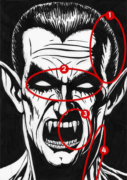
What actually displeases me most are the following things:
- The head is too wide, especially the right side
- The eyes (and ears) aren’t level
- The mouth seems kind of asymmetrical
- The neck muscles are too dissimilar
In other words:
The basic proportions are okay here, but there are some symmetry problems.
After trying to optimize those things with a healthy dose of computer magic and flipping it back it looks like this:

Now let’s look at the original painting compared to the ‘fixed’ one:
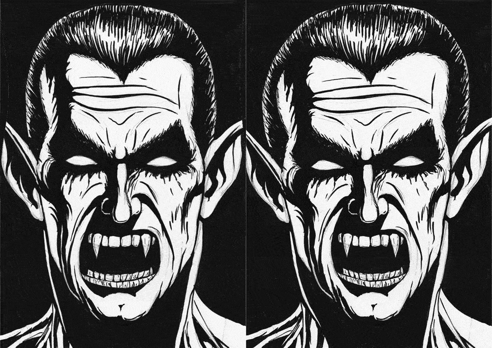
That’s much better, right?
» Learn Drawing FAST With Thousands Of High-Quality Courses Here
Now let’s do the same thing with the Batman drawing.
Its main problem is that the right side of the face (the part that’s in the shadow) is a bit smaller than the left side of the face. And the whole face is somewhat distorted.
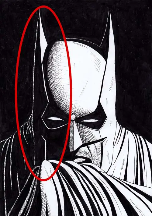
After distorting it digitally and flipping it back I ended up with this:
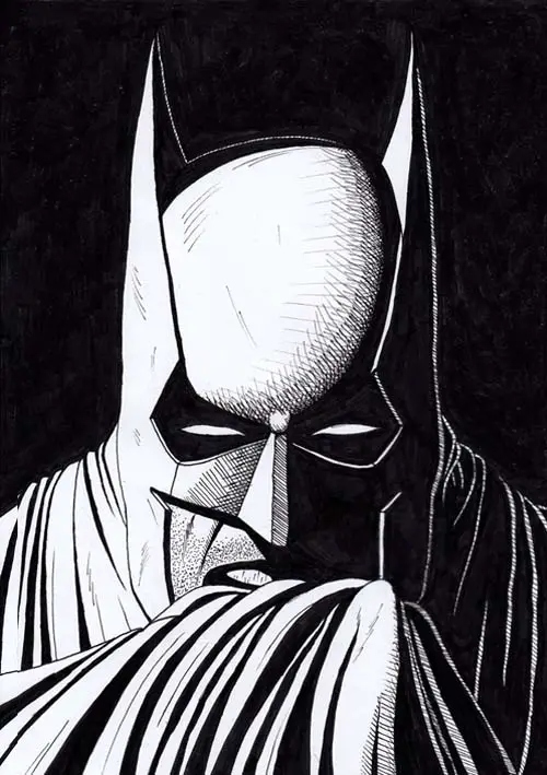
Let’s look at a before/after animation here, too:
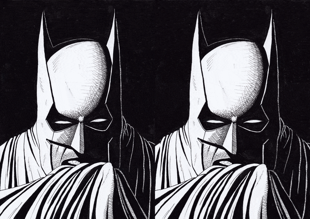
To be fair the difference is not as apparent as with my Dracula image. I guess that means the drawing was better, ha!
CHECK OUT: How To Draw Shadows On A Face
4. Why Your Drawings Look Better Upside-Down
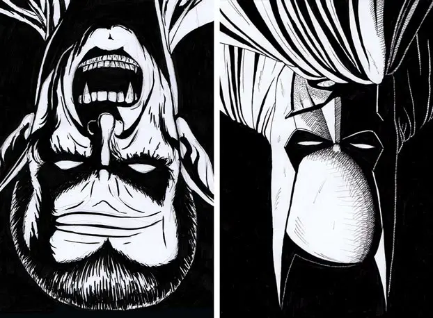
Have you tried turning your drawings upside-down? Did it look better? If yes, what’s the reason for that?
Your drawings look better upside down because your brain can’t instantly recognize the subject or object you have drawn. It only recognizes shapes and colors. Therefore any mistakes you made in your drawing aren’t immediately visible in your upside-down drawing.
For that reason, I think flipping your canvas vertically has a different effect than flipping it horizontally.
It might hide your mistakes instead of revealing them.
I haven’t experimented with this, but drawing upside-down seems to be a useful exercise in itself.
5. Three Ways To Flip Your Artwork
Now that we know how it all works – how can we actually do it?
It’s simple. There are three ways to mirror your drawing:
5.1 Turn It Around And Hold It Against Light
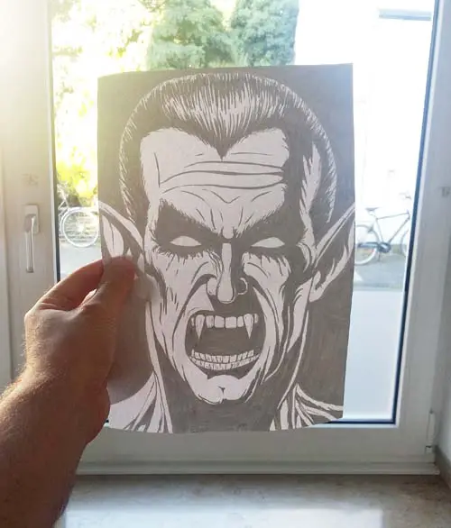
Simple and easy. Just pick up your painting and hold it against a light source like the sun, a window or the ceiling light of the room you’re in.
NOTE: This obviously only works with thin paper that is opaque enough for light to shine through. If you use high-quality drawing paper that is thicker, you can use the following methods.
5.2 Use A Mirror
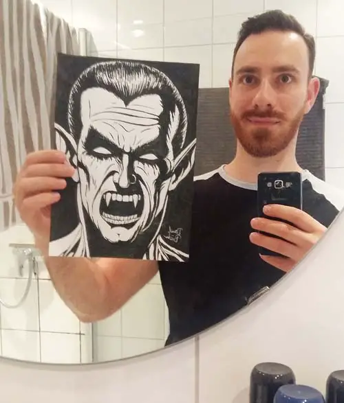
Every household has a mirror somewhere. So just hold up your drawing and stand in front of a mirror.
5.3 Flip It Digitally
This is the modern 21st century way. Digitize your artwork by scanning it or taking a photo of it and flip it on your computer or your smartphone.
Photoshop isn’t even a must, you can do it for free in a lot of other ways.
I’ll first deal with computers and then with mobile devices.
5.3.1 How To Flip Your Canvas In Windows Photo View
1. Open your image in Windows Photo View
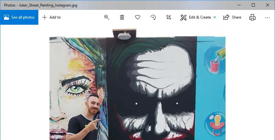
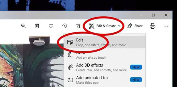
2. Click on ‘Edit & Create’ and then on ‘Edit’
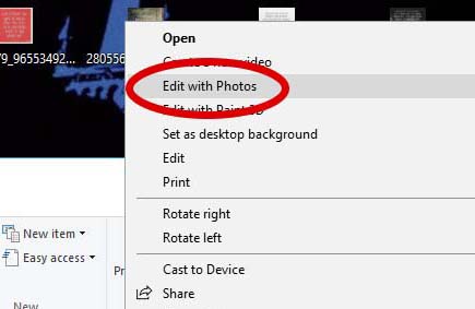
TIP: To get here faster, right-click on your image and then on ‘Edit with Photos’.
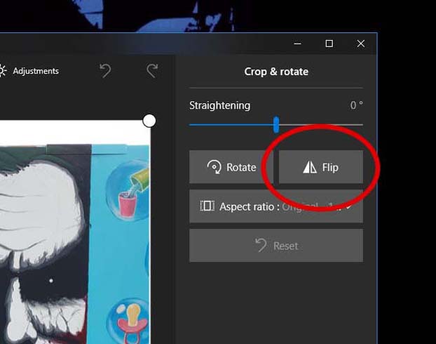
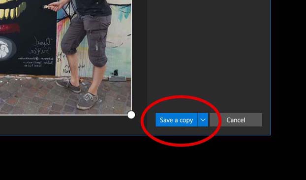
3. Click on ‘Flip’
4. Click on ‘Save a copy’
5.3.2 How To Flip Your Canvas In Paint
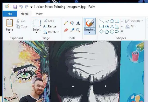
1. Open your image in Microsoft Paint
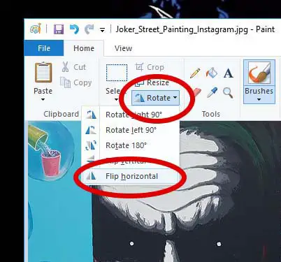
2. Click on ‘Rotate’ and then on ‘Flip horizontal’
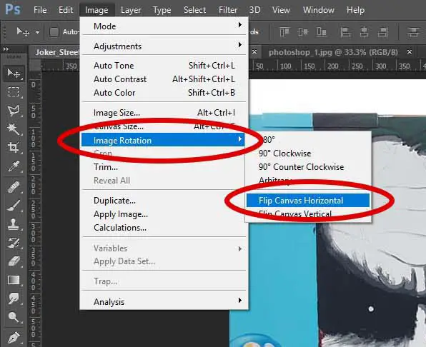
5.3.3 How To Flip Your Canvas In Photoshop
1. Open your image in Photoshop
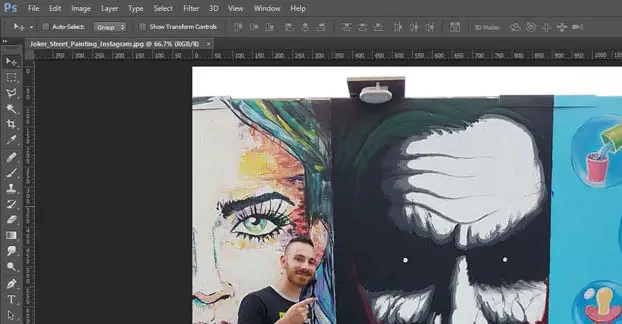
2. Click on ‘Image’ → ‘Image Rotation’ → ‘Flip Canvas Horizontal’
5.3.4 How To Flip Your Image Online
Nowadays, there’s a website for pretty much everything. Accordingly, there are websites dedicated exactly to what we want to accomplish.
A good choice is http://flipapicture.com/.
1. Go to the website

2. Click on ‘Choose File’ and pick an image

3. Select ‘Flop Horizontally’ and click on ‘Click here’

4. Save the flipped picture by right-clicking anywhere on it and choosing „Save Picture As“
5.3.5 How To Flip Your Canvas On Mobile Devices
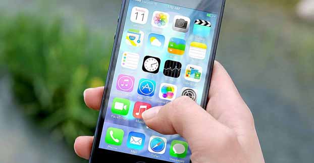
Android and iOS versions are continually updated. In some versions, you can flip an image with the standard image viewer and in some versions, you can’t. It would be too complex to list all possible scenarios.
There are a lot of very easy-to-use apps though that do what we want.
For example, good ones are
Flip Image – Mirror Image (Android)
and
QuickFlip (iOS).
They’re free and pretty much self-explanatory.
6. Why You Should Flip Your Drawings More Often
The sad thing is that this technique is often an afterthought.
I myself know how it is:
You have a new idea for an amazing painting, you plan your composition, lighting and colors… and then you’re eager to start and jump into the sketching phase.
One of your first sketches turns out great and before you even know it you have a finished piece of artwork.
But then you happen to flip it and are bummed out because your work could have been much better, had you just put some more time into the preliminary drawing.
It doesn’t have to be this way and it shouldn’t!
You could actually save yourself a lot of frustration if you just flipped your image every now and then before rendering all the details.
This can help you lay a better foundation for your finished piece of art and make it look way better in the end.
Furthermore, you can only get better by doing this!
By regularly confronting yourself with your own drawing mistakes, you might notice patterns. Things you draw wrong regularly. It helps you to improve in those areas and it also helps you to see better.
I know that a lot of people don’t use this as much as they should – especially beginner artists.
I for myself should use it way more often.
For my next art project, my goal is to flip my canvas a few times in the sketching process, to lay a great foundation for my finished piece that I’m going to be happy with when all is said and done!
7. Word Of Advice: Don’t Cheat!
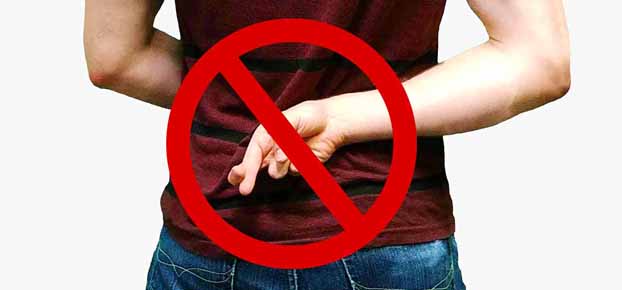
Finally, I want to make something very clear: This isn’t meant as a shortcut to success.
So:
Don’t cheat!
Don’t use the flip trick as a magic pill to fix your drawings digitally once they are finished.
This won’t help you become a better artist and it will deceive everyone who looks at your art.
Even worse, you will deceive yourself and it won’t make you truly happy in the end. Be honest to yourself and everyone around you.
Use the flip trick during the drawing process to fix mistakes you might not have seen at first.
You will learn how to see the things you often draw wrong and improve your art more quickly as a result. It’s like magic!
-Daniel
P.S.: Just to let you know: I have a YouTube channel, too. I’d appreciate it if you check it out!
READ NEXT:
Why Your Sketches Look Better Than Your Finished Art

…use a mirror 😂 veeery nice. Useful overview! Now there are no more excuses not to do this trick.
How to mirror your drawing: Use a mirror. Great, right? 😀 Thanks!
I’ve already started using this effective trick in my next big drawing. The preliminary drawing is way better than it would have been without using the flip trick…
To everyone but the artist there is no difference between original and reversed image. That’s why I chuckled when you showed the mirror image: the mistakes are not less obvious on the original.
Anyway, gtg, I got some photoshopping to do on one of my own drawings…
Interesting. I guess you’re right.
I think it’s still a useful way to make the mistakes apparent to the artist himself/herself.
But presenting it the way I did probably makes little sense, if the mistakes really are obvious to the reader from the get-go and not only after flipping the image.
I will probably rewrite parts of the article to rectify this.
Thanks for your input!
idk, im a bit confused, because when you put the dracula’s original and and the flipped drawing below, i didn’t necessarily liked the original more than the other, it’s that if you look at one image a lil bit more then the other one looks weird for some secs. umm, i dont believe in making things absolutely symmetrical, even human faces aren’t really made perfect.
Interesting!
What about the Batman drawing? Did you notice a difference there?
If not, that supports the theory of JMM, that it’s just visible to the artist himself.
It could also mean that my Dracula drawing is just better than I thought… 😉
Seriously though, I think it’s both true:
While creating it the artist gets used to looking at the drawing in one way and it automatically starts to look weird or even “wrong” to him when flipped. Even if it might look perfectly fine to other people. That’s when your drawing is good and doesn’t have some big mistakes…
But when your drawing is NOT that good and has some mistakes, I think flipping it is still a great way to make these apparent.
One caveat:
First, my drawings are a front view of the face without perspective.
I understand what you mean… you shouldn’t make everything perfectly symmetrical because that is unnatural. But I think a certain degree of symmetry is necessary in this situation to not make it look completely off. Maybe some other drawings that use more perspective are a better example.
I’m curious, if other people will chime in and share their opinion on the matter!
As an aspiring artist, this is one of the most demotivating aspects about learning to draw – I can’t believe that I can trick myself into loving my work especially when I put my best effort into it, and suddenly it was all just a delusion from my brain cause flipping it reveals obvious flaws
But I’m gonna keep at it, me and my lightbox all the way!
Yeah, I guess it can be quite demotivating when you first learn about it.
But like I tried to describe in section 6 of the article, don’t let this get you down. Now that you are aware of this phenomenon: use it! Try flipping your artwork several times while creating it. That way you can fix your mistakes before you start rendering and drawing all the details.
Try to stay positive. In time, your ability to judge your own drawings will improve, too – and flipping won’t reveal terrible mistakes anymore.
Really cool information! Thx!
👍👍👍
Cool, glad it was helpful! 🙂
No offense of course, but I kind of see what you saw. And I’ve been flipping my stuff since I started. It can be quite shocking and sobering.
None taken!
Yes, it can be quite shocking, but also enlightening and helpful, right? 🙂
Asymmetrical work has a purpose. If your first image is to be a monster, then the asymmetrical image is much more powerful than the symmetrical one. The symmetrical one loses a bit of that grittiness. If you are doing a superhero, like the Batman, then you want more symmetry, but not perfect. He still has to be somewhat relatable. It is the same with human faces. The more symmetrical, the more likeable. The more asymmetrical, the less the character is a hero. Too perfect and it is not relatable.
Let’s also take the Starbucks Mermaid. She was symmetrical originally. To the artists they did not like her. She was too perfect. She lost a bit of her essence because in real life nothing is perfectly symmetrical. They skewed a bit of details and liked her much more. She seemed more relatable.
Using the symmetry and asymmetry intentionally in your artwork, particularly understanding the psychology behind it, along with your intent, will take your art up another level.
Thanks for your comment!
What you say is definitely true to some extent. Playing with symmetry/asymmetry can be part of the creative process, for sure.
I just think there’s a difference between the intentional use of asymmetry and an unintentional distortion of a drawing.
I don’t think my Dracula drawing from above is a good example of drawing something in an asymmetric way deliberately. I didn’t do it and it shows.
It looks more like a drawing mistake than anything else.
I think you can see if an artist knows his perspective (etc.) and those tiny little imperfections are deliberate or not.
I didn’t know the fact about the Starbucks mermaid. It’s interesting. I played around with the logo a bit and found that it’s really just a tiny difference from side to side.
The right eye has a SLIGHTLY different shape (slanted to the right a bit). It’s almost not noticeable.
What’s more interesting to me is the shadow of the nose, which is bigger on the right side. It doesn’t just make the logo look more interesting in general, but also makes the lighting situation a bit more believable, I think.
I saw your paintings for the first time so I wasn’t blind to the mistakes due to over watching one of the paintings for long time. One of them looked for me fine but after you flipped it It looked bad. I think that are brain tend to see things differently from the right side and the left side. It is true that after fixing mistakes after flipping the drawing mostly would make your drawing looks better. So I genuinely think It’s a combination of what are brain prefer to see from one side and the blindness that caused by over watching one side.
Cool! This is further anecdotal evidence that the flip trick can help you spot mistakes by resetting your view of your artwork.
Thanks for the comment!
I just did this with several of my character drawings and I have discovered two mistakes I generally make: slightly wonky eyes and slightly wonky hair. It’s not that noticeable when you look at them the original way, but those little mistakes do stand out when you flip. The rest is quite good: generally no leaning bodies when they don’t need to be leaning and no messed up hands or anything like that. Of course there are some pieces where I do make a mistake like that, but they’re far and few between. I’m also not too hard on myself when I make a mistake, because I feel that sometimes a character with a leg that is slightly thicker than the other leg is actually better than two legs of identical thickness. It makes my characters feel more real when they’ve got things like that going on.
So, I guess what I’m trying to say, is that not every ‘mistake’ is automatically a mistake. Symmetry is cool and all, but it takes something very human out of your art when you go overkill with it.
And in the end, if you’re just a hobbyist like me, you should just have fun making art and not worry too much about making it perfect (still put in some effort of course). Nothing in this world is perfect, so why should your art be?
I agree. Nothing’s perfect. For a hobbyist, which most artists are, it’s a good idea to not beat yourself up about bad drawings (actually for pros too, haha). The focus should be on having fun, yes!
But I think the more your art resembles what you first imagined in your head, the more fun drawing is. And your art and your imagination get closer and closer the better you get.
I think part of the fun of creating art is actually improving over time. Humans strive for progress. It’s wired in our DNA. It’s evolution. 🙂
Hmm, very interesting!
I disagree with your last point, however. I can see how those doing physical art could view editing your art digitally and the claiming it as physical art would be considered ‘cheating’.
As a digital artist, though, editing and moving things around is just par for the course and is part of what makes doing digital art so appealing. I fail to see how flipping your art at the end to find errors and fixing them is any different from doing so mid-way. Although doing is throughout the process would be a lot more efficient, if I flip at the end and have to move things around that a lot of shading and stuff that I have to fix up.
As far as I know, the only way to really ‘cheat’ with art is to copy or trace another person’s work and claim it as your own, or claim to use certain mediums/techniques but use others instead/as well.
I wrote this post almost two years ago and, to be honest, I don’t remember exactly what I thought when writing that last part. I think my point was that it’s not right to create a piece of traditional art, scan it into your computer and then edit it extensively before presenting it to others on social media (for example). That way you deceive not only others but yourself too. Plus you won’t learn as much as you would using the flipping trick regularly throughout the drawing/painting process.
I see what you mean, though. In digital painting, it’s indeed more efficient to do the flipping before your piece is completely finished. Like you said, this way you won’t have to fix as many parts of your painting. And on top of that, you will be confronted with your own mistakes more often than if you would only flip it once at the end. This can help you recognize patterns more quickly – and improve faster as a result.
I just tried horizontal flipping my art god how much I have edited! It improved my art a lot! I feel more confident with my work now thank you!
Cool! Glad you like it! I hope you can see your own drawing mistakes better now.