Note: This post contains affiliate links. As a Skillshare Affiliate and Amazon Associate I get commissions for purchases/signups made through links in this post.
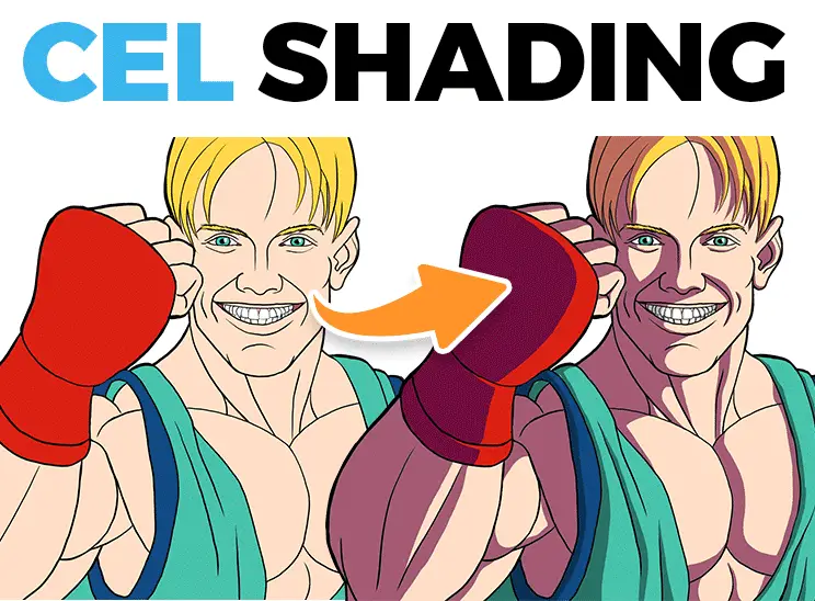
Cel Shading is actually incredibly simple. The concept is so simple that anyone can understand it.
Table of Contents
What is Cel Shading?
Cel shading is a stylized form of shading. Instead of painting hyperrealistic light and shadows, you dumb it down to just two values:
Light and shadow.
The edges between these values are 100% hard. There’s NO blending involved.
But how do you use it on your characters? Where exactly do you put the shadows and what colors should you use?
I’ll show you how you can find the perfect shadow edge any time and how you can make much better color choices.
And at the end I’ll show you a special trick to learn cel shading faster than ever.
But first, we need to master the basics!
How to Paint Cel Shading On Basic Forms
The first problem you face is the placement of the shadows. Where exactly is the shadow edge?
Sphere
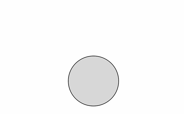
So, here is every artist’s friend, a simple sphere:
I know, I know, you’ve probably seen this a thousand times. But stick with me here, it’s important!
As you can see, I’ve already painted it with a basic tone.
If this sphere is hit by light rays – where do you place the shadow?
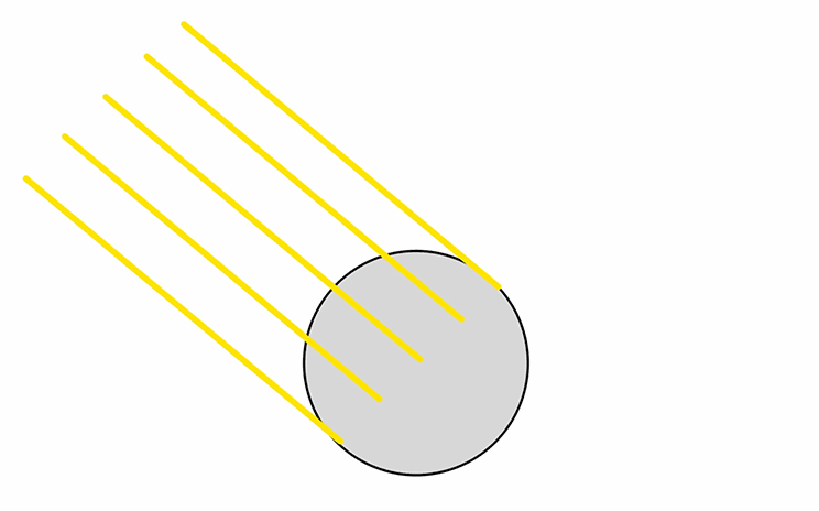
It depends on the position of the light source:
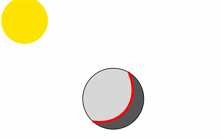
If the light comes from the top left and you view the object directly from the side, it would look like this:
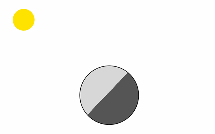
The sphere is receiving light in the area marked in red:
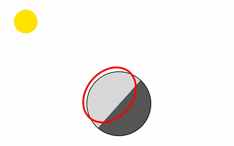
But as the form turns away from the light, it receives less. At some point the form reverses direction and doesn’t receive any more light:
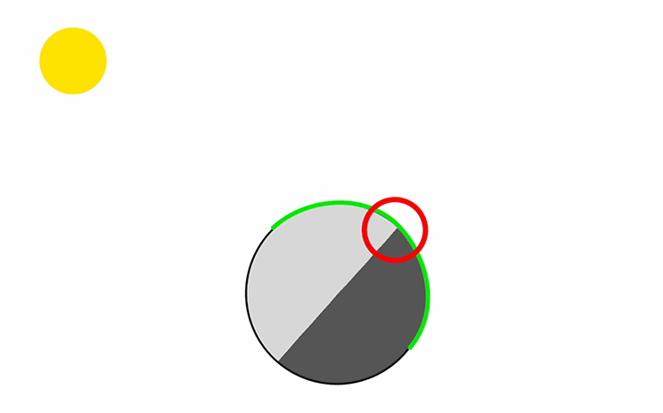
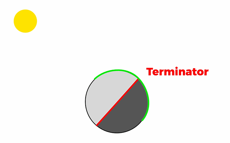
And that’s where the shadow starts.
Artists call this the Terminator.
If the light moves toward you, you see more of the light area and the shadow shape gets smaller:
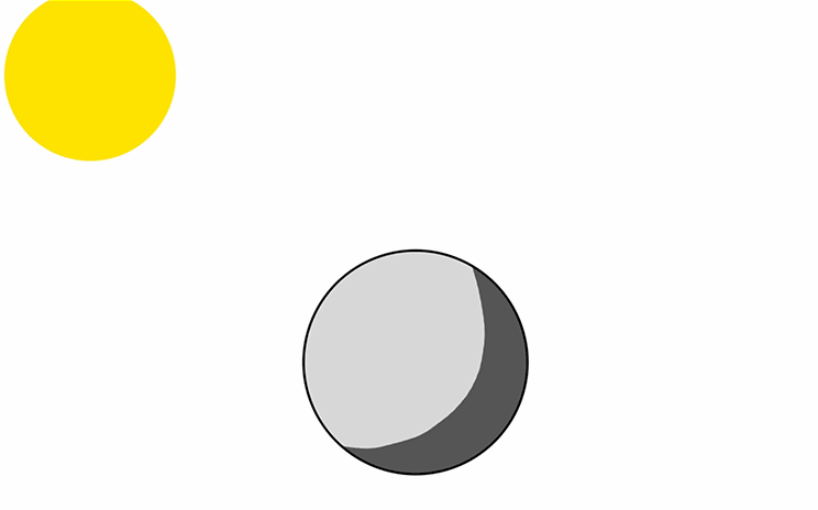
The shadow always follows the form of the object. In this case, it’s round, like this:
If the light moves away from you, the shadow shape gets bigger and it looks the other way round:
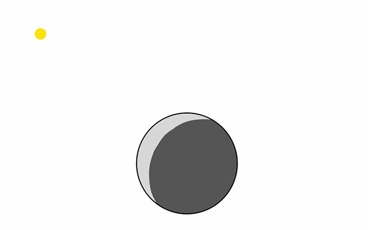
This is basically the whole concept:
Start painting the shadows at the exact point where the form turns away from the light.
Before we get to the juicy stuff, Let’s quickly look at some other forms:
Cube, Cuboid, Pyramid
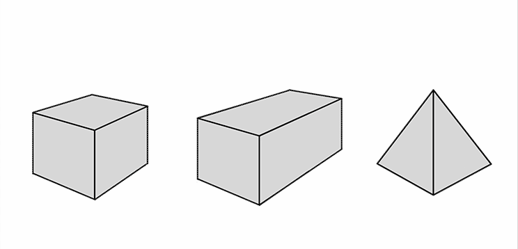
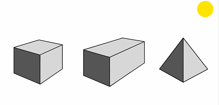
Here we have a cube, a cuboid and a pyramid.
These angular forms are even simpler to paint with cel shading.
Depending on the direction of the light source, just one or two of the side planes of the forms are in shadow.
In this case, the light is coming from the top right, so it looks like this:

The two missing basic forms are cylinders and cones:
Cylinder, Cone
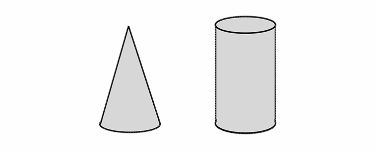
Since these forms are rounded, they behave similarly to a sphere.
Depending on where the light is coming from, the Terminator changes position.
So it could look like this with a light source behind the object:
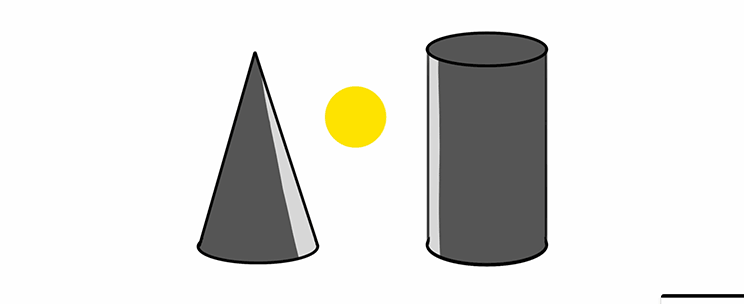
Or it could look like this, with a light source from the right side of the object:
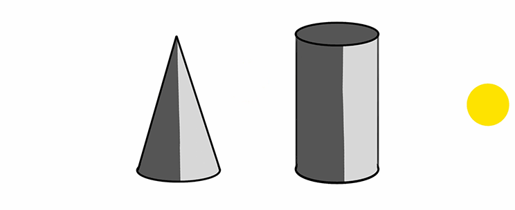
Now, are you still with me? Then let’s apply this to some real characters!
How To Use Cel Shading On Your Characters

How do you apply this to your characters?
To use this style of shading on your characters, you can simply think of your characters like a collection of simple forms.
Here I constructed a character out of basic forms.
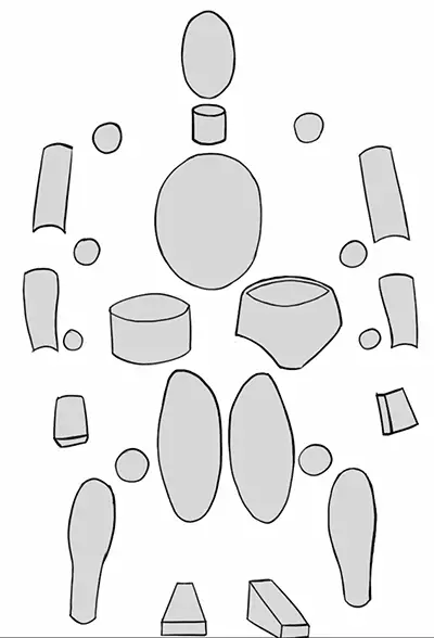
If you can shade every one of these forms, you can shade the whole characters as well.
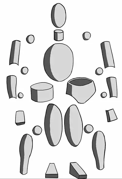
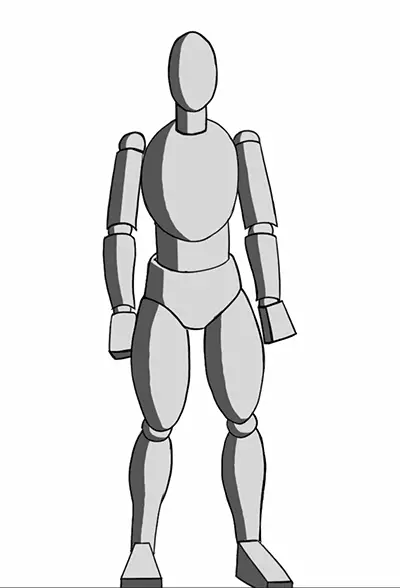
If we now look at an actual finished drawing, cel shading works the same way.
Start painting your shadows at the point where the form stops receiving light.

If you are shading anything that is made up of more complex forms, it’s obviously more difficult than when shading just simple forms. BUT you can make up pretty much any form from these basics.
Unfortunately, I can’t make you good at this by explaining it any other way.
Because it’s based on my own experience as an artist.
To get good at this, you need to look at lots of other people’s art and also start observing light and shadow in real life.
Strong sunlight is especially helpful for this because it produces very hard shadows. It’s very easy to imagine this as two values – even if there is actually more variation in the tones.
As I said earlier, the shadows always follow the form of the object. So when painting complete characters, you have to think of the bones, muscles, the fat and the skin.
This is where your knowledge of anatomy really comes into play. So, make sure to be a good little artist and practice your anatomy!
Painting Cast Shadows When Cel Shading
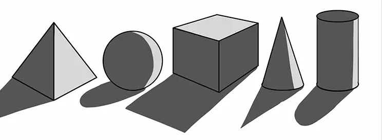
Now, before we even talk about things like color… if something still doesn’t feel right with this shading, it’s because we haven’t looked at a very important thing.
The thing normal people think of first, when talking about shadows. The shadows created by objects blocking the light:
Cast shadows!
Let’s return to our beloved basic forms for a second:

When these objects get hit by light, they block the light, so the light can’t reach the ground.
This creates the cast shadows.

The interesting bit happens, when shadows are cast on other objects. Because everything casts a shadow somewhere.
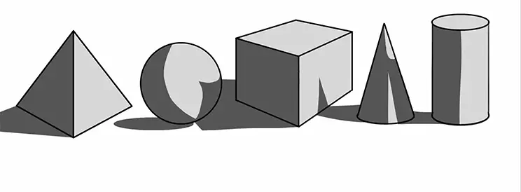
Returning to our character painting, there are several elements that cast shadows.
In this case the nose, the head itself the hair strands, the lips, the training suit and even little details like the chest, the wrinkles on the face, and the sternocleidomastoideus (yeah, right).
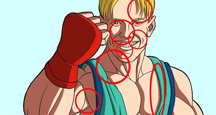
Remember: shadows always follow the form of the object. That goes for cast shadows as well.
How To Color Your Cel Shading
So, finally let’s talk about the elephant in the room:
What colors should you use with cel shading?
Basically, it’s no different than with any other painting. And this would actually require an in-depth class on light and color which is too much for this article.
But here are some quick ideas for you to try out:
Use High Contrast
Look at this painting for example:

It looks alright, really. But just making the shadows darker can make it look much better:

Why is that? Because the human eye craves contrast.
The brighter the light and the darker the shadows, the better it will look – to a point!
Of course, this suggests a strong light source, like sunlight. If you want a more dreamy look, like you were using pastel colors, that’s totally fine. It’s just another style:

But generally, I suggest trying to use high contrast.
How much contrast? How dark should you paint the shadows?
Well, I’ve heard artists recommend to make the shadow color 20 to 30% darker than the light color.
That’s a good starting point, but in my experience you can even go further to like 40 to 60%. But it always depends on the individual painting, of course.
Try Painting Black Shadows

In reality shadows are pretty much never black. That’s because there’s almost always some kind of ambient light and reflected light.
Nevertheless, it can be a cool stylistic choice to make shadows 100% black.
You can see this a lot in superhero comic books. A great example is the art of Mike Mignola, the creator of Hellboy. He paints completely black shadows over the initial drawing. And later it gets colorized digitally.
Black shadows look so appealing because they offer the maximum amount of contrast – you can’t really make the shadows any darker than that, right?
Use A Warm Light With Cool Shadows

Apart from using black shadows, you can try the following.
Mimic realistic lighting situations. For example: sunlight.
Sunlight naturally has a warm color tint. Depending on the time of day it can range from yellow to orange.
To use this in your cel shading you can try to shift the color of the light tones towards yellow. Not complete yellow, mind you, but just a little color shift.
To enhance this effect you can couple that with cool shadows.
When the sun is shining, shadows often look blue-ish. That’s because the sky itself is also a light source. This light is called ambient light and tints the shadows in a cool color.
So, shift the shadows towards blue or even purple colors. Depending on how stylized you want to make your characters, you can push this effect very far:

The essence of this is to use a warm light with cool shadows.
Use A Cool Light With Warm Shadows

Another thing you can try is the opposite of this.
What we just did is to combine warm and cool colors. This looks appealing because these types of colors naturally create contrast – a so-called “warm-cool contrast”.
Actually, this works the other way round, as well:
Tint the light colors towards blue and tint the shadow colors towards red or orange.
This is essentially the opposite, but still creates a warm-cool contrast.
It’s a bit harder to pull off, but can also look very nice.
So, try using a cool light with warm shadows.
Improve Faster With My FREE e-Book!

Learn how to MASTER drawing in 5 easy steps with my FREE PDF guide!
Discover a methodical way to learn drawing effectively!
Improve Your Cel Shading in Digital Art
Now, how can we take this cel shading style to the next level?
If this still looks a little too simplistic for your taste, let’s spice things up a bit!
Paint More Details
When looking at this painting, I think it’s not bad:

But you could do so much more with it! The shadow shapes are very simple and basic.
To make this visually more interesting, we can just paint in more little folds and bumps and stuff like that.

Just give the eye more things to look at.
In short: Paint more details!
Just this simple step alone can improve the cel shading look a ton.
Use A Second Light Source
But there’s more you can do:
Who said you can’t use more than one light source?

By adding another one, you can make everything much more interesting.
You’re essentially introducing a third tone into the mix.
Try to position the second light source opposite the main light. This way the new light illuminates parts of the shadow color.
As for the color of the second light, feel free to try things out.
You can use a colored light:

Or even an extremely bright white light. That can look awesome as well:

Add More Tones
The next tip is the one you might have been waiting for.
Cel shading essentially uses just two values. But since we just added another value… why not add even more?

Adding even more light sources would make things too convoluted. But we can use more brightness variations for the main light source.
Instead of painting only one tone that represents the areas where your character is hit by light, you can add more variations.
Use midtones and highlights to your advantage.
If you want to know how to paint midtones, I have the perfect video for you on my YouTube channel:
So, adding more tones can make your cel shading look much better.
Cel Shading Trick
I’m not done yet.
How do you learn to pick out the light and shadow values easily?
And how do you get a feeling for positioning the light and shadow shapes to make it look believable?
Well, luckily, there is a cool trick I want to show you:
Use the Threshold filter.
This is a tool available in most painting programs. It basically converts an image into black and white.
This way you can easily pick out the shadow shapes and over time get a feeling for painting realistic looking shadows.
I’ve made a short video about this, check it out:
The Next Step
Now, painting the shadows on a face can be very tricky.
It’s essential to get the shapes right because otherwise it will just not look realistic at all.
And if you get the shapes just a little bit wrong, the result just isn’t as good as it could be.
Luckily, there is a system for this. Light actually creates repeatable shadow patterns on a face and knowing these can make a big difference in your art.
So read this next article to learn how to shade faces:
READ NEXT:
Where Are The Shadows On A Face? [And How To Draw Them]

Really awesome article. I have heard about cel shading and the topic was really scary, so I never learned but this article made it a lot simpler to understand. Great read!!
Thank you! I’m glad I could help you. The right explanation can make any topic easy to understand. 🙂